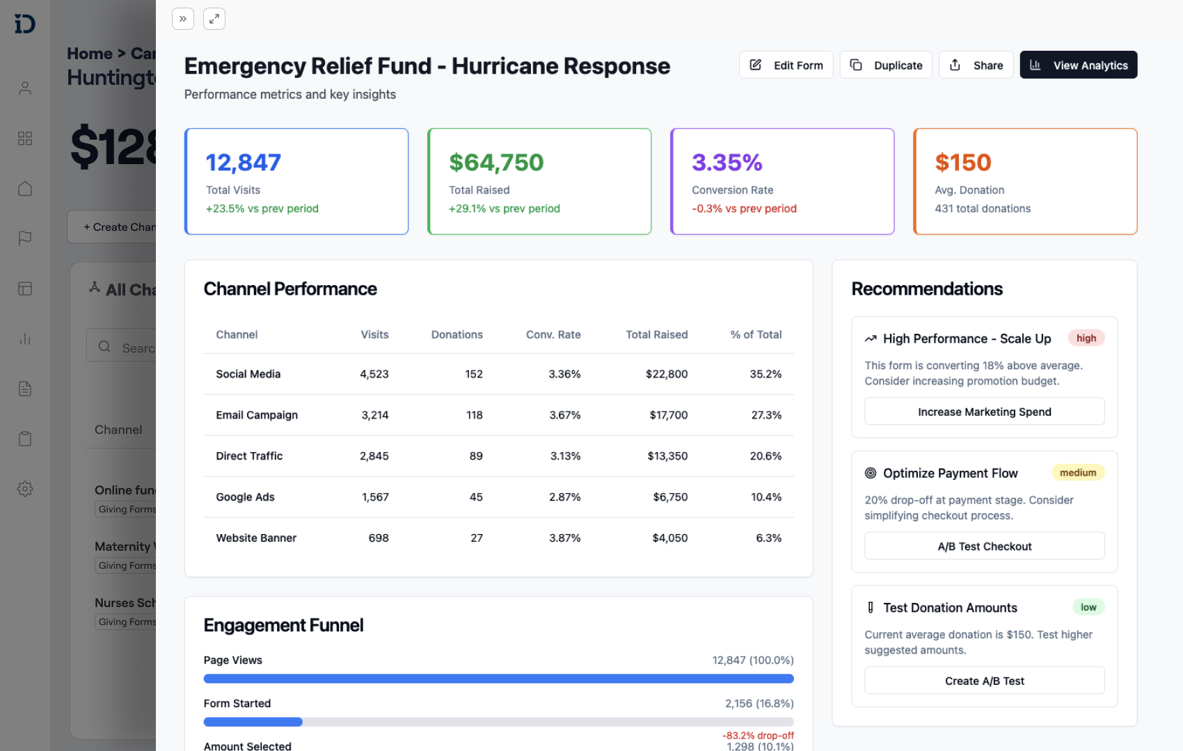
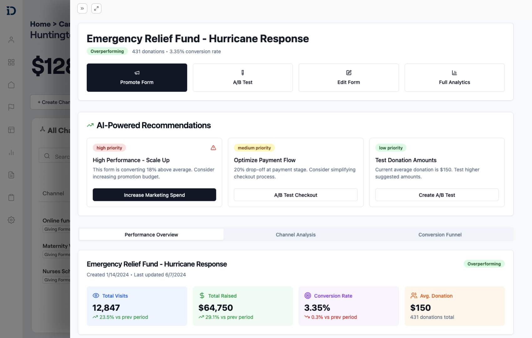
IDonate had a fractured user experience
With duplicate screens
Following separate design patterns
Case Study Highlights

Designing a product vision that guides admins and donors toward better outcomes

iDonate had three legacy systems and fragmented user experiences, making it hard for admins to manage campaigns and for donors to feel confident giving.

Project Tags:
Product Vision
System Design
Design System
Published: Oct, 2025

The Story So Far

My challenge was to define a vision that could bridge technical goals with real user needs while laying the foundation for scalable design. Beyond managing the current migration, I also needed to ensure iDonate’s systems could evolve intelligently into the future.

Role
Lead UX Designer & Product Strategist.
Focus
Human-Centered, System-Driven Design.
Strength
Shaping Vision into Reality.
Approach
Collaborative, Thoughtful, Data-Informed.

The Challenge

My challenge was to define a vision that could bridge technical goals with real user needs while laying the foundation for scalable design. Beyond managing the current migration, I also needed to ensure iDonate’s systems could evolve intelligently into the future.

My First Moves

  1. System Audit

  2. User Interviews

  3. Synthesize Research

To ground myself and the team, I performed a full audit of the system and set up user interviews to understand priorities, workflows, and blockers.

The entire system audit was well over 150 screens.

I dove deep into each flow and annotated them with issues that came up during user interviews and ideas on how to improve them.

Identifying Key Problems & Synthesizing Research

The audit and user interviews revealed three issues that were systemic and consistently kept users from reaching their goals:

System Passivity

The platform surfaced data but rarely prompted action.

Lack of Hierarchy

Important information and workflows weren’t clearly prioritized.

System Passivity

users had little support navigating complex tasks.

A Passive System

Although the screen looked data-rich, it was mostly read-only. Users were frustrated that they couldn't act on the information or get guidance on what to do next.

User Hierarchy of Needs

As I thought about these issues, I started asking what a fundraising platform should really do. In my mind, the ideal platform would know what a great campaign and donation form look like, and then use data from across clients to help improve them. Over time, it wouldn’t just guide users but actually optimize performance on its own as things change.

I mapped iDonate's user needs as a hierarchy, from the manual system users relied on today to a future where the platform intelligently optimizes itself.

Formulating the Product Vision & UX Principles

With the hierarchy of needs and core problems in mind, I defined a north star to guide design decisions. This took shape as a product vision, which I then translated into a set of UX principles.

Prioritize What Matters

Surface the most important information at the right time.

Structure With Meaning

Create clear hierarchies so admins can focus on what's essential.

Guide Toward Success

Provide prompts, nudges, and feedback that help users complete their goals.

An initial concept for highlighting the metrics and actions users cared about most, drawn from user interviews.
An early draft exploring how hierarchy could bring clarity to the page.
I was thinking about how we could introduce"guiding" a user to take beneficial actions into the system.

Design Explorations

With the Vision and UX principles in place, I went through a series of explorations and rapid usability tests to see how users were responding to the changes.

The Devil in the Details

During testing, users shared that they needed to see different information depending on their role. The current system always ‘forgot’ their settings, and the new designs would greatly benefit from allowing users to save their preferred views.

I worked on a feature where the system would detect changes made to a data table.
Users would be able to save their changes as a "View."
The system would now load their saved view as default.
Users would still be able to modify their view, and the system would be able to track it without overriding it unless they saved it.

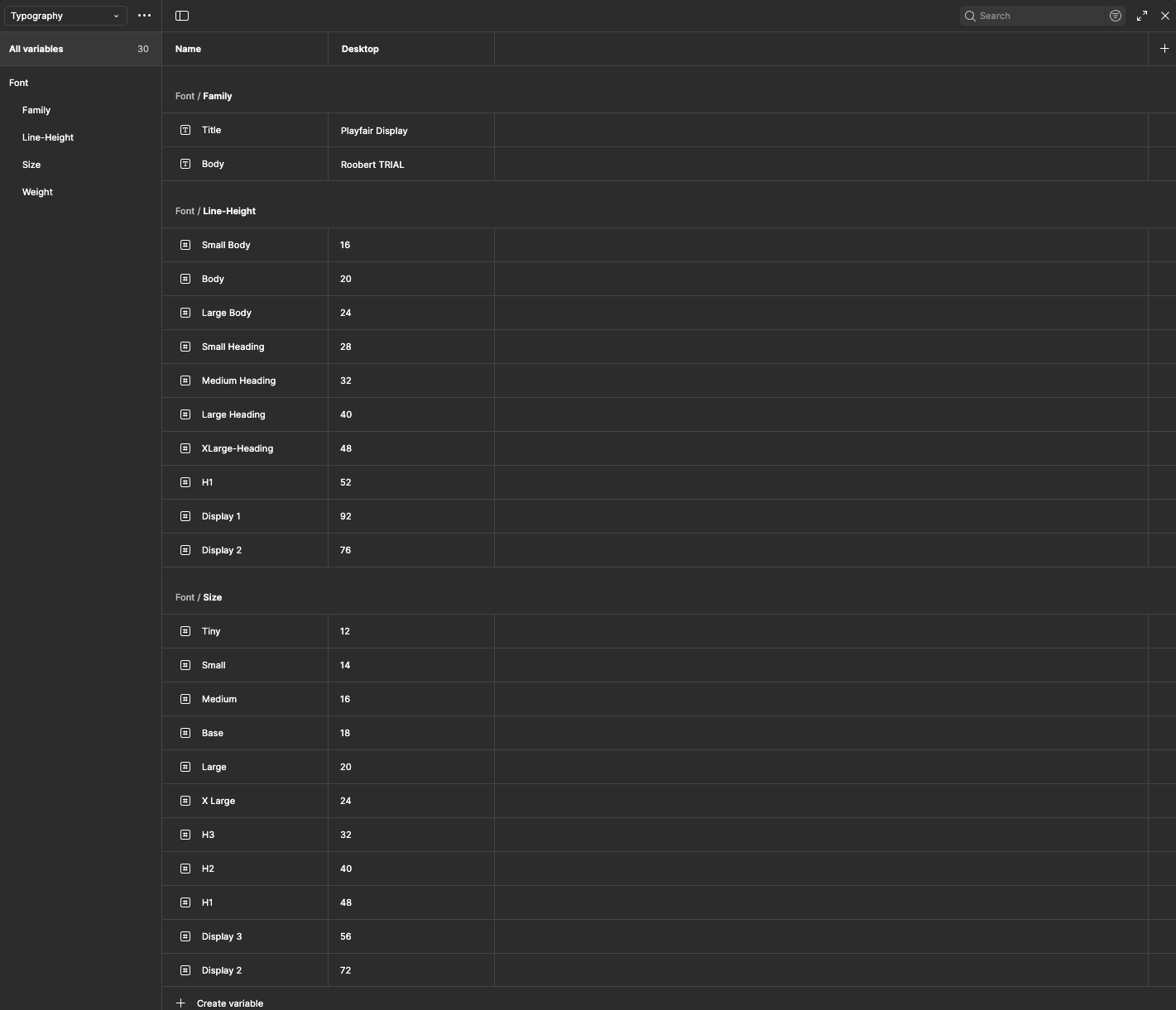
The Need for A Design Library

While I was exploring designs, it was made clear to me that iDonate lacked a design library. At the same time, a developer I worked closely with raised concerns about design handoff, and I wanted to keep our relationship open and collaborative. Building a library would address both needs: it gave developers a reliable source of truth and created a foundation that I and future designers could build upon.

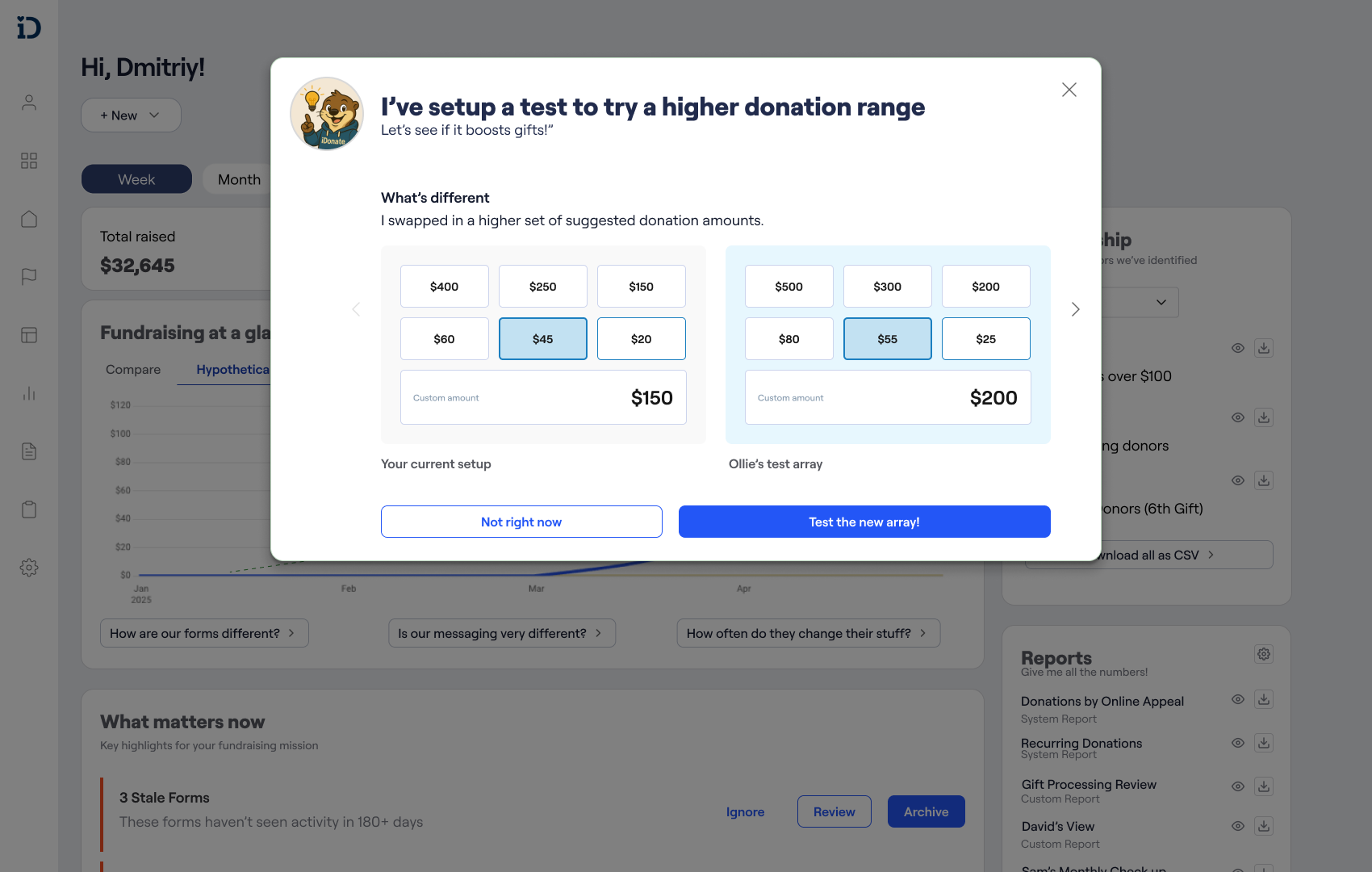
Guidance - The Introduction of the 'Nudging System'

Admins often struggled to know what to focus on next. Important tasks could get buried in fragmented workflows, leaving campaigns stale or incomplete. In thinking about the user hierarchy of needs, this was the leap from manual effort to being guided by data. To solve it, I created the Nudging System, a design pattern that surfaces actions that matter most and keeps admins moving towards successful outcomes.

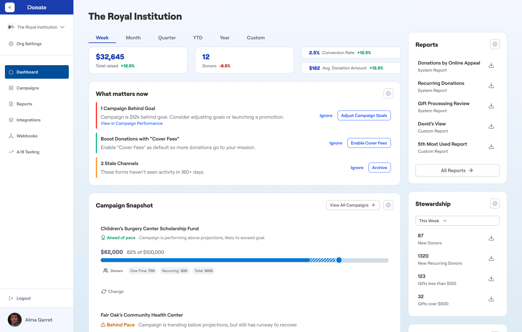
The What Matters Now card that surfaces important tasks.
The Nudging System works by providing users guidance towards success like increasing donor conversions.
One persistent issue that admins had been complaining about how ‘messy’ their system had become. The Nudging System was designed to help them quickly remove the mess.

Guidance as Onboarding

Another benefit of this Nudging System was it acted as a natural onboarding tool.

The What Matters Now card also doubles as great onboarding tool for new clients.

Guidance Powered With Data

The real value of the Nudging System was in tapping into iDonate’s data on clients and their fundraising performance. With this data, the system could start by guiding users toward the right actions and, over time, move closer making optimal choices for them, pushing toward the top of the user hierarchy.

By learning from donation form performance across the platform, the system could guide users toward better decisions — and gradually move from guidance to optimization.

Outcomes in Action

Through this work, I was able to provide iDonate with a clear product vision and UX principles that could guide the next phase of their platform. Alongside that vision, I delivered concrete steps and design directions, like the Nudging System and Design System, that gave the team a path toward simplifying admin workflows, building donor trust, and setting the foundation for the future of giving.

Updated Dashboard that acts as a command center.
A reorganized Campaign page with sub pages and key metrics.
Donation form with clear hierarchy and guidance.

Final Thoughts

For me, the real value in this project was showing how design can move a product from reactive tools to proactive systems. By framing the work through the user hierarchy of needs, we could see not just how to fix problems today, but how to grow toward a platform that anticipates and optimizes for its users. We’re not at the top of that hierarchy yet, but with the principles and systems in place, iDonate is a lot closer. That’s the type of design work I want to keep doing, work that provides clarity, vision, and a clear path forward.

Like what you're seeing?

Let’s team up for your next project or collaboration. ‍